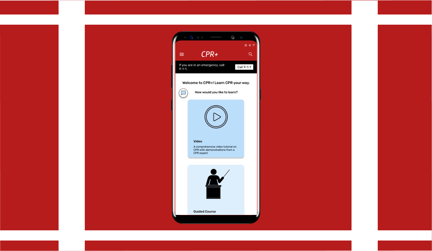
For my third and final project for the Google UX Design Professional Certificate, I was tasked with designing an app and complementary responsive website for helping people learn to do CPR. I created CPR+, a tool that offers online CPR tutorials in multiple formats. CPR+’s target audience is general audiences over the age of 18 with some or no prior experience with CPR.
Project duration: October - November 2021
Project Overview
The Problem:
CPR is a valuable life-saving technique for anyone to know, and some individuals are required to learn it for their professions. But CPR courses are often expensive and time-consuming, and may not fit the learning preferences of all audiences.
The Goal:
Design a digital tool that provides users with multiple different ways to learn CPR conveniently and easily. For maximum convenience the tool should be available as both a responsive website and mobile app, and should provide features that help them stay informed about CPR knowledge.
My Roles:
My roles on the project.
Responsibilities:
Conducting user interviews and secondary research, paper and digital wireframing, low and high-fidelity prototyping, conducting usability studies, accounting for accessibility, iterating on designs, and responsive design.
UX Research
Research Summary:
I conducted user interviews with several individuals who had various levels of experience with CPR. Some had passing knowledge of the steps while others had been formally trained in the past. Some of the common sentiments were that they would prefer to learn how to CPR from structured courses, but that there were frustrating barriers to in-person courses like costs and time commitments. Additionally, the users wanted to be able to easily access information about CPR standards in order to refresh their memories and check if anything had changed with regards to the formal recommendations. I also conducted a competitive audit, and found that a significant gap in my competitors’ products was a lack of variety in the formats of their free learning content offerings.
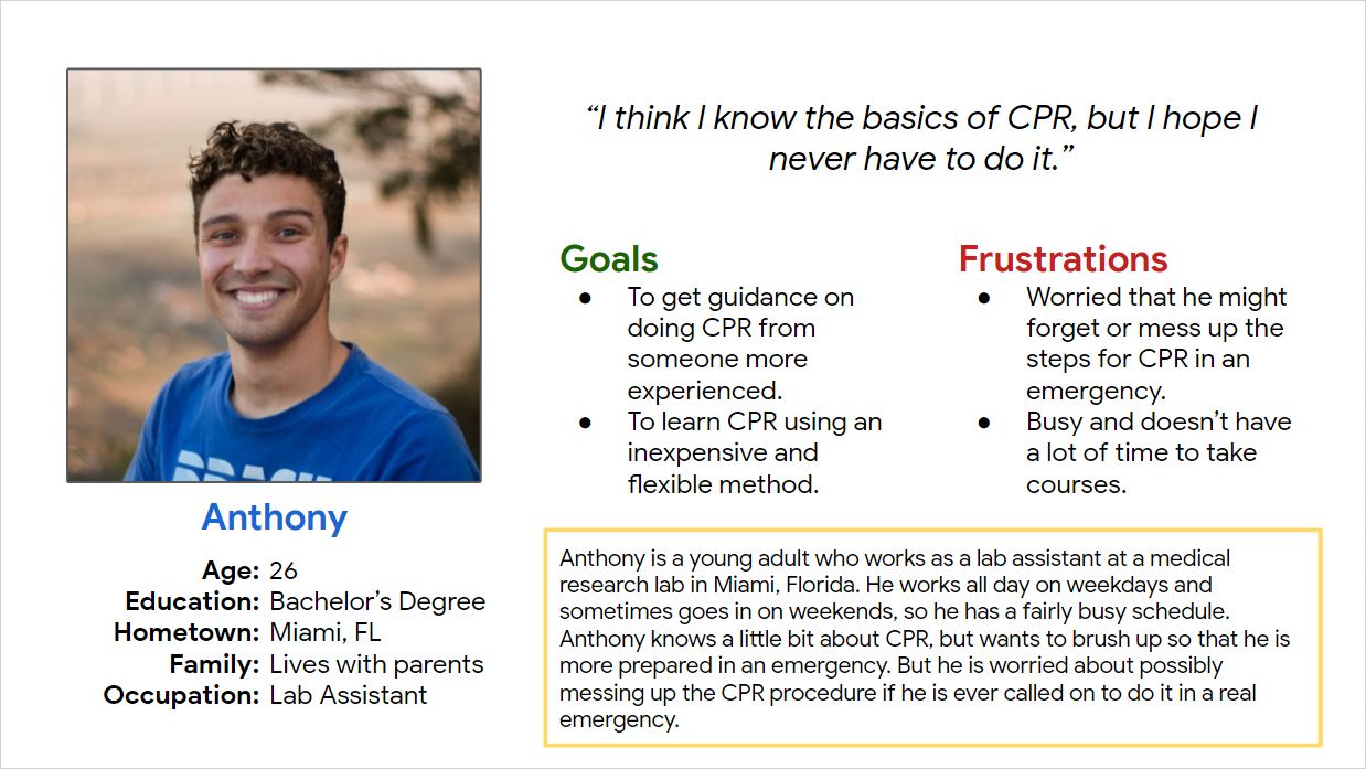
Persona: Anthony
Problem Statement:
Anthony is a young adult
who needs an easily accessible resource about CPR
because he wants to be able to refresh himself on CPR procedures at his convenience.
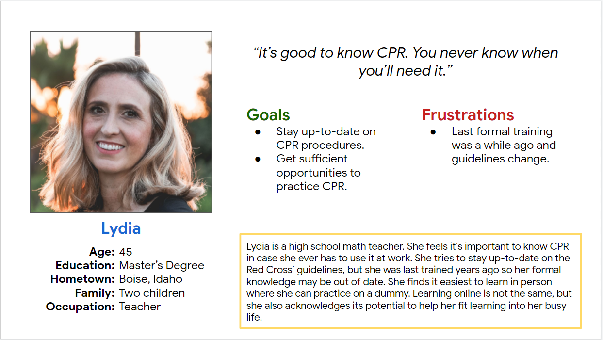
Persona: Lydia
Problem Statement:
Lydia is a teacher
who needs up-to-date information and resources about CPR
because some time has passed since she was certified and she wants to stay current and refreshed.
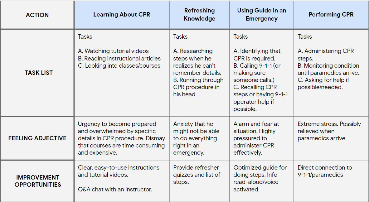
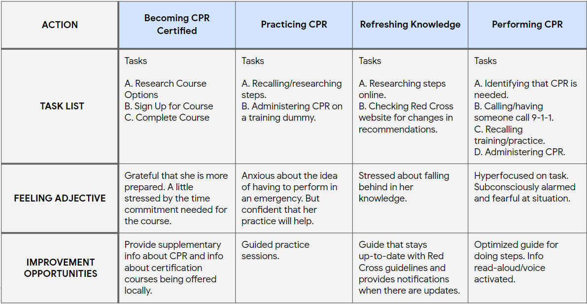
Anthony’s User Journey Map:
Mapping Anthony’s user journey revealed that aside from formal learning materials, in some use cases there might be a need for quick access to essential CPR information.
Lydia’s User Journey Map:
And creating Lydia’s journey map showed that users will need access to the most up-to-date information about CPR, even after completing their initial learning.
Starting the Design
Ideation:
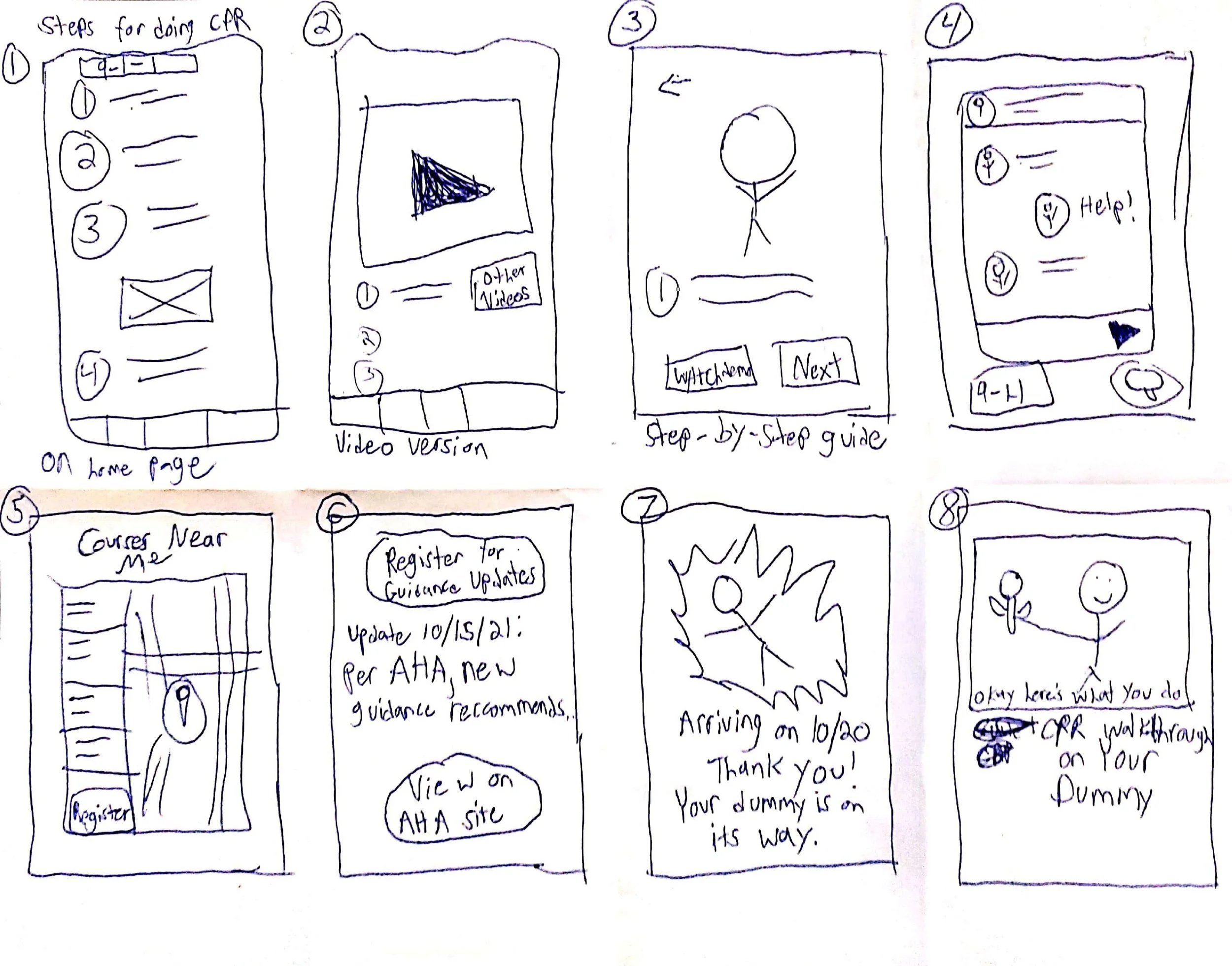
I did a Crazy-8s ideation exercise to come up with ideas for how to address gaps identified in the competitive audit. My focus was specifically on designing creative ways for learning content to be delivered, and coming up with features to supplement the learning process.
Digital Wireframes:
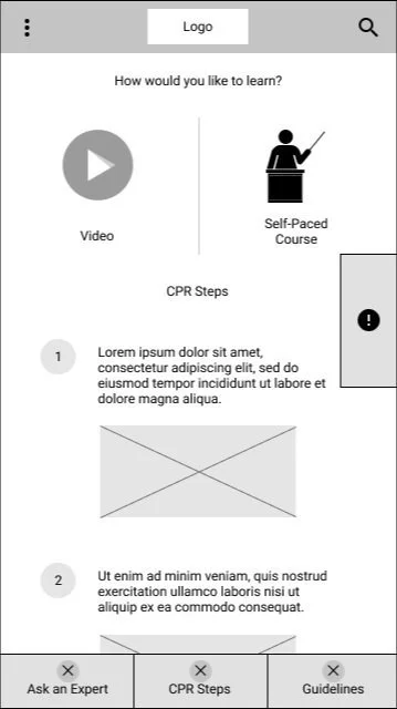
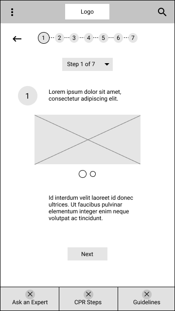
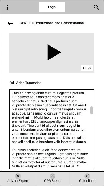
After ideating and drafting some paper wireframes, I created the initial designs for the CPR+ app. These designs focused on offering multiple learning methods to help suit the wide spectrum of user preferences.
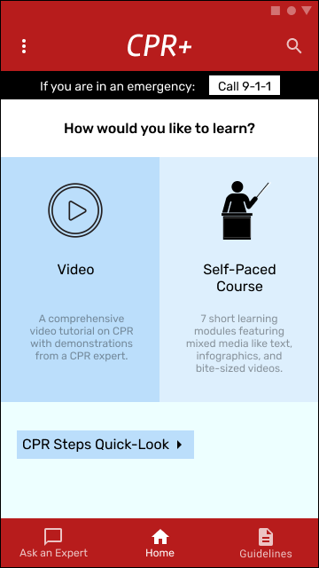
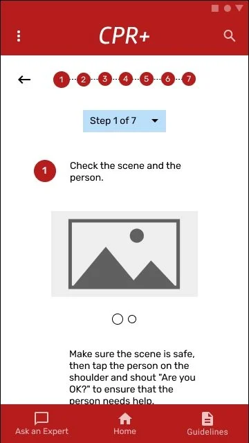
CPR+ offers two different learning methods, Video and Self-Paced (Guided) Course. Quick access to the essential CPR steps provides a reference and helps users refresh their memories.
Low-Fidelity Prototype:
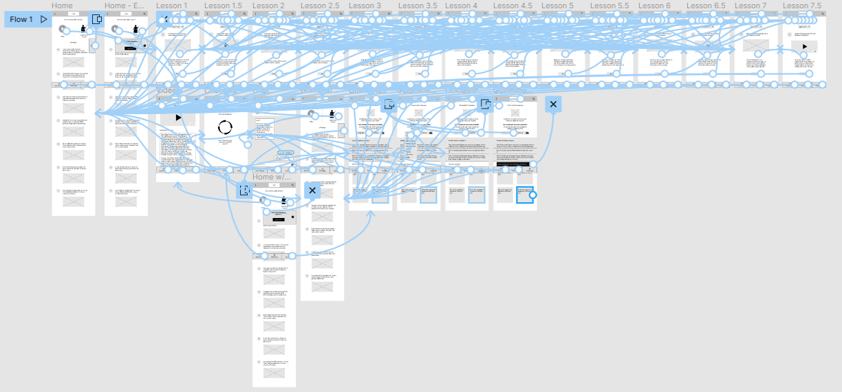
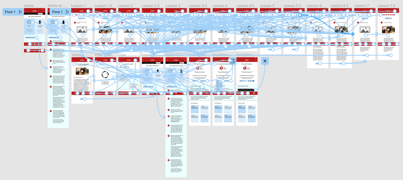
To prepare for usability testing, I created a low-fidelity prototype that connected the user flow of going through one of the CPR courses included in the app and viewing updates to the official CPR guidelines.
1st Usability Study: Parameters
Study type: Unmoderated Usability Study
Location: Remote, United States
Participants: Five participants between the ages of 18-70 of varying demographic characteristics.
Length: 15-minute tests that took place between October 20th - 22nd 2021.
1st Usability Study: Findings
Key Finding #1: Users were unsure of what the purpose was of the tab that was meant to provide guidance in an emergency.
Key Finding #2: Some users thought the CPR steps quick-look guide on the home page was another learning option like the video or guided course.
Key Finding #3: Users did not like that the prototype asked them to choose a language to view CPR guidelines in, as they felt English would be assumed.
Refining the Design
Mockups:
Based on the insights from the usability studies, I applied design changes like using visual cues to clearly differentiate the CPR learning options (Video and Guided Course) from the supplementary quick-look guide on the home page.
Pictured above, the old home page (left) and the new home page after implementing changes based on the results of the usability study (right.)
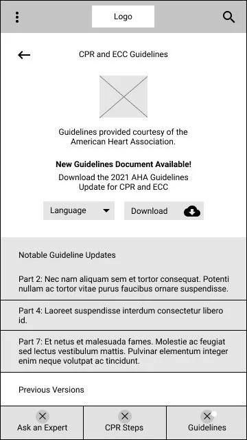
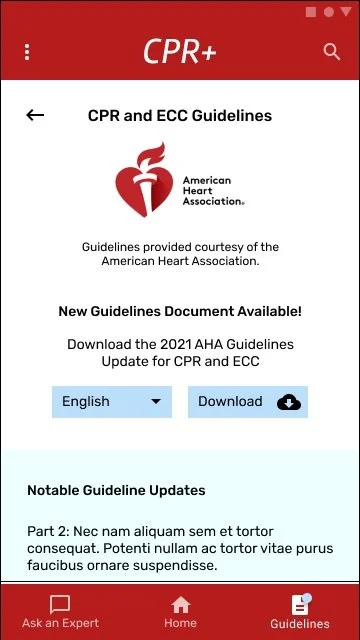
Additional design changes included making English the default language options for CPR guideline documents, and re-creating the design of the emergency guide on the home page to make its purpose more clear.
Pictured above, the old CPR guidelines page (left) compared to the newer mockup (right.)
High-Fidelity Prototype:
The high-fidelity prototype followed the same user flow as the low-fidelity prototype, including design changes made after the usability study.
Accessibility Considerations:
Consideration #1: Clear labels for interactive elements that can be read by screen readers.
Consideration #2: Design meets WCAG AAA standards for color contrast.
2nd Usability Study: Parameters
Study type: Unmoderated Usability Study
Location: Remote, United States
Participants: Five participants between the ages of 18-70 of varying demographic characteristics.
Length: 15-minute tests that took place between October 27th - 30th 2021.
2nd Usability Study: Findings
Key Finding #1: Some users could not tell from the visual design on the home page that the two learning options were clickable links.
Key Finding #2: Some users expressed interest in using CPR dummies along with their course work. I concluded that providing dummies was outside of the current scope for my project but could be revisited later.
Refined Mockups:
After receiving feedback from the 2nd round of usability testing, I applied changes to the visual appearance of the two learning options to provide clearer signifiers for users.
Above, the original home page mockup (left) compared to the refined mockup after the 2nd usability test (right), which has adjustments made to key visuals.
Responsive Design
With the app designs completed, I started work on designing the responsive website.
Information Architecture:
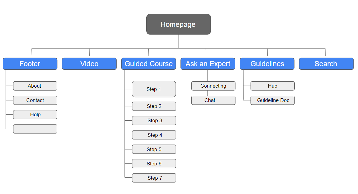
I drew up a sitemap for CPR+ to guide the organizational structure of each screen’s design to ensure a cohesive and consistent experience across devices.
Responsive Design Mockups:
The designs for screen size variation included mobile, tablet, and desktop. I optimized the designs to fit specific user needs of each device and screen size.
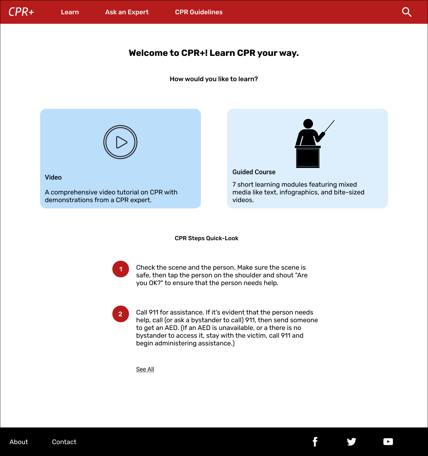
From left to right, the home page designs for the mobile, tablet, and desktop versions of the responsive website for CPR+ are pictured above.
Going Forward
Takeaways:
Impact: Users shared that they thought the CPR+ app/website could actually be useful for teaching people CPR. One quote from a user was that “having multiple learning options like this is great because everyone learns in different ways.”
What I Learned: I learned that it was important to provide flexibility to users to allow them to interact with content in their own way. Additionally, in order to make CPR+ feel like a more accessible and convenient solution to learning CPR than traditional courses, focusing on simplicity was key.
Future Plans:
Plan #1: Conduct research on how successful the app actually is in teaching users how to perform CPR.
Plan #2: Perform another usability test on each of the responsive website user flow mockups.
Plan #3: Add alternative text and other accessibility considerations to the design.
Thank you!
Thank you for reviewing my work on the CPR+ app and website! If you would like to contact me about my work, please feel free to reach out to me at mtomasello62@gmail.com.
