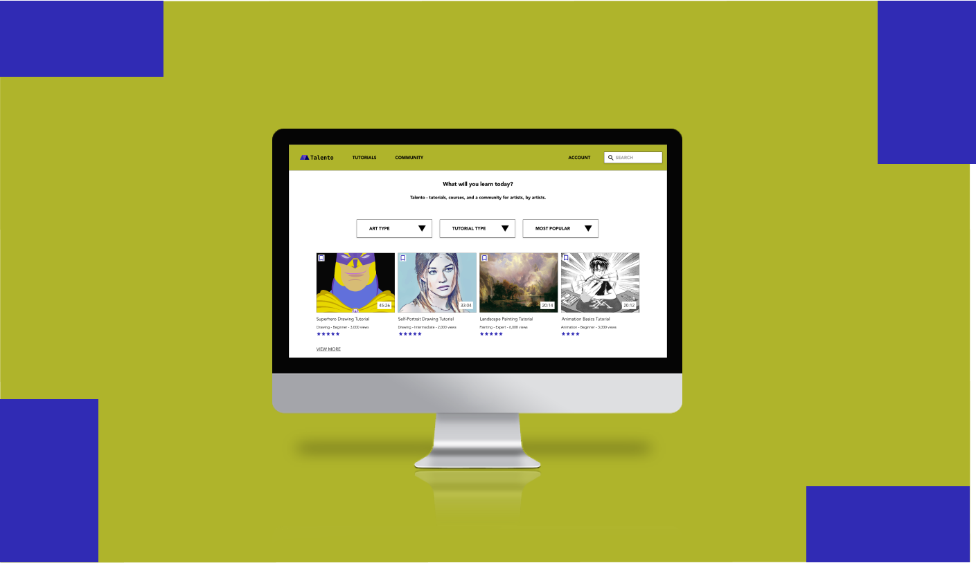
As part of my coursework for the Google UX Design Professional Certificate, I was tasked with designing a website for finding and viewing art tutorials. I created Talento, a website that offers free video tutorials about various art skills like drawing, painting, and animating. The website’s target audience is artists of any skill level, from beginners to professionals, including both young/teenage users and adults.
Project duration: September - October 2021
Project Overview
The Problem:
Available e-learning websites often don’t focus on visual arts and many have outdated designs. They also lack the ability for artists to seek critiques on their work.
The Goal:
Design a website for Talento that has a modern, easy-to-use layout for its videos, as well as features that help artists to get constructive criticism on their work.
My Roles:
My roles on the project.
Responsibilities:
Conducting user interviews and secondary research, paper and digital wireframing, low and high-fidelity prototyping, conducting usability studies, accounting for accessibility, iterating on designs, and responsive design.
UX Research
Research Summary:
I conducted user interviews, which I then turned into journey maps to better understand the target users and their needs. I discovered that artists like following video tutorials to learn skills and techniques, but sometimes don’t know where to find these tutorials. They don’t want to pay for professional courses unless they are sure they are reputable. They also often find it easier to learn when they have references to work off of and other artists that they can turn to for feedback and encouragement. Without support from others or ease of access to learning materials, artists can get discouraged and may not continue with their efforts. They also need the flexibility to pause and resume their work to fit into their schedules without losing their place.
Pain Points:
Flexibility - Users need to be able to easily pause and resume the tutorials they are taking/work they are doing, because learning a skill takes a long time and they may not be able to do it all in one sitting.
Community - Without the ability to get feedback from fellow artists, users feel isolated and have a harder time staying motivated to continue working.
Accessibility of Resources - Paid courses are prohibitively expensive and may not be worth the cost. Free tutorials are scattered around on different websites and may lack helpful features.
Persona: Evan
Problem Statement: Evan is a college student and amateur artist who needs access to a community of other artists because feedback from his peers helps him learn and stay motivated.
Persona: Jodie
Problem Statement: Jodie is a professional artist looking for quality learning resources to pursue with her limited time and availability.
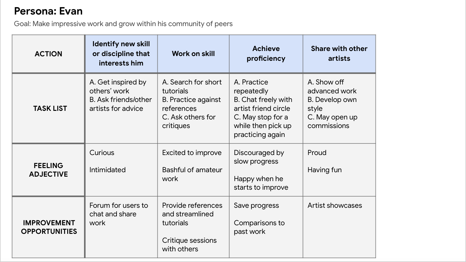
User Journey Maps:
Mapping Evan’s user journey revealed how useful communication with other artists could be for keeping him motivated at every stage of his learning process.
And mapping Jodie’s user journey illustrated the importance of streamlined, comprehensive tutorials with clear milestones for users who are dedicated but have busy schedules.
Starting the Design
Sitemap:
I tried to organize the information architecture to make it as easy as possible for users to find tutorial videos, as that is the most important piece of the user flow.
I also made community features like Showcases easily accessible, based on their importance to my users.
A sitemap helped me plan a high-level overview of Talento’s layout and information architecture.
Paper Wireframes:
Next, I sketched out paper wireframes for each screen in my app. I drew four variations of each one, then combined their best aspects into a fifth version.
Above, the home screen (left) and showcase screen (right) variations focus on addressing the pain points of needing easy-to-find content and community feedback.
Paper Wireframe Screen Size Variation:
Because Talento’s users will likely access the site on a variety of different devices, I started to work on designs for additional screen sizes to make sure the site would be fully responsive.
Digital Wireframes:
Moving from paper to digital wireframes made it easy to understand how to use my design to address user pain points and improve the user experience.
Providing immediate access to tutorial content and site features using a varied, layered layout was a key part of my strategy.
On the home page (above), users have quick access to filters so they can view the type of content that interests them. They are also immediately exposed to the site’s community-based features.
I also made digital versions of both my desktop and mobile design variations.
Low-Fidelity Prototype:
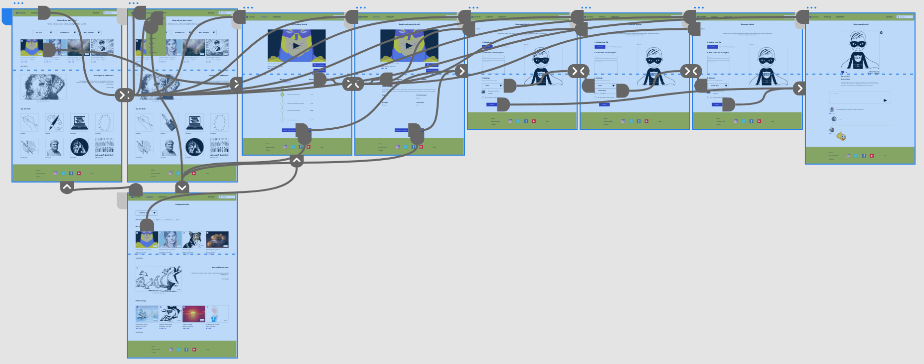
To create a low-fidelity prototype, I connected all the screens involved in the primary user flow of finding and watching a tutorial video and uploading a piece of artwork as a showcase for feedback.
At this point, I had received feedback on my designs from some other designers regarding the layout and button locations. I made sure to listen to their feedback, and implemented several of their suggestions.
1st Usability Study: Parameters
Study type: Moderated Usability Study
Location: Remote
Participants: Five participants between the ages of 18-70 of varying demographic characteristics.
Length: 20-minute tests that took place between September 21st - 26th 2021.
1st Usability Study: Findings
Key Finding #1: Participants wanted to know more info about a video before watching it, such as the difficulty level and rating.
Key Finding #2: Participants weren’t always clear on what the purpose of the “Showcase” feature was.
Key Finding #3: Participants expressed interest in saving a video so that they could watch it later.
Refining the Design
Mockups:
Based on the insights from the usability study, I made changes to give users more information about tutorial videos alongside the titles and thumbnails. Knowing the video ratings, length, type of art, and more should help users decide which videos are right for them. A button for bookmarking videos was also added to give users the freedom to save tutorials for later right from the home page.
Pictured above, the old home page (left) and the new home page after implementing changes based on the results of the usability study (right.)
Mockups: Original Screen Size
Mockups: Screen Size Variations
I included considerations for additional screen sizes in my mockups based on my earlier wireframes. Because users are used to watching online videos on different devices, particularly mobile phones, I felt it was important to also optimize the designs for mobile so users have the smoothest experience possible.
High-Fidelity Prototype:
My hi-fi prototype followed the same user flow as the lo-fi prototype, and included the design changes made after the usability study.
View the Talento high-fidelity prototype.
Accessibility Considerations:
Consideration #1: I used headings with different sized text for clear visual hierarchy.
Consideration #2: I used landmarks to help users navigate the site, including users who rely on assistive technologies.
Consideration #3: All colors used in the visual design pass WCAG AA color contrast standards at a minimum.
I also conducted a 2nd round of Usability Testing using my high-fidelity prototype, to find any pain points my users might have with my design mockups.
2nd Usability Study: Parameters
Study type: Unmoderated Usability Study
Location: Remote
Participants: Five participants between the ages of 18-70 of varying demographic characteristics.
Length: 20-minute tests that took place between October 1st - 9th 2021.
2nd Usability Study: Findings
Key Finding #1: Participants felt the visuals were somewhat flat and not attention-grabbing.
Key Finding #2: Multiple participants expressed an interest in seeing user comments on tutorial videos.
Key Finding #3: Some users were still unsure of the website’s purpose until taking the time to move through the different pages.
Going Forward
Takeaways:
Impact: My target users shared that the website layout was intuitive and felt that the Showcase would help them improve their work. They thought the overall purpose and usefulness of the site was clear.
What I Learned: I learned that it’s important to know what information users want to know about content before engaging with it, so that you can create a better user experience by providing them with it upfront. Having a genuine understanding of their needs can lead to the creation of a more understandable information hierarchy.
Future Plans:
Plan #1: Further refine mockups based on findings from 2nd round of usability testing.
Plan #2: Improve accessibility with alt-text for images and meet WCAG AAA standards for color contrast.
Thank you!
Thank you for reviewing my work on the Talento website! If you would like to contact me about my work, please feel free to reach out to me at mtomasello62@gmail.com.


