Frankie’s Fat Sandwiches App Design
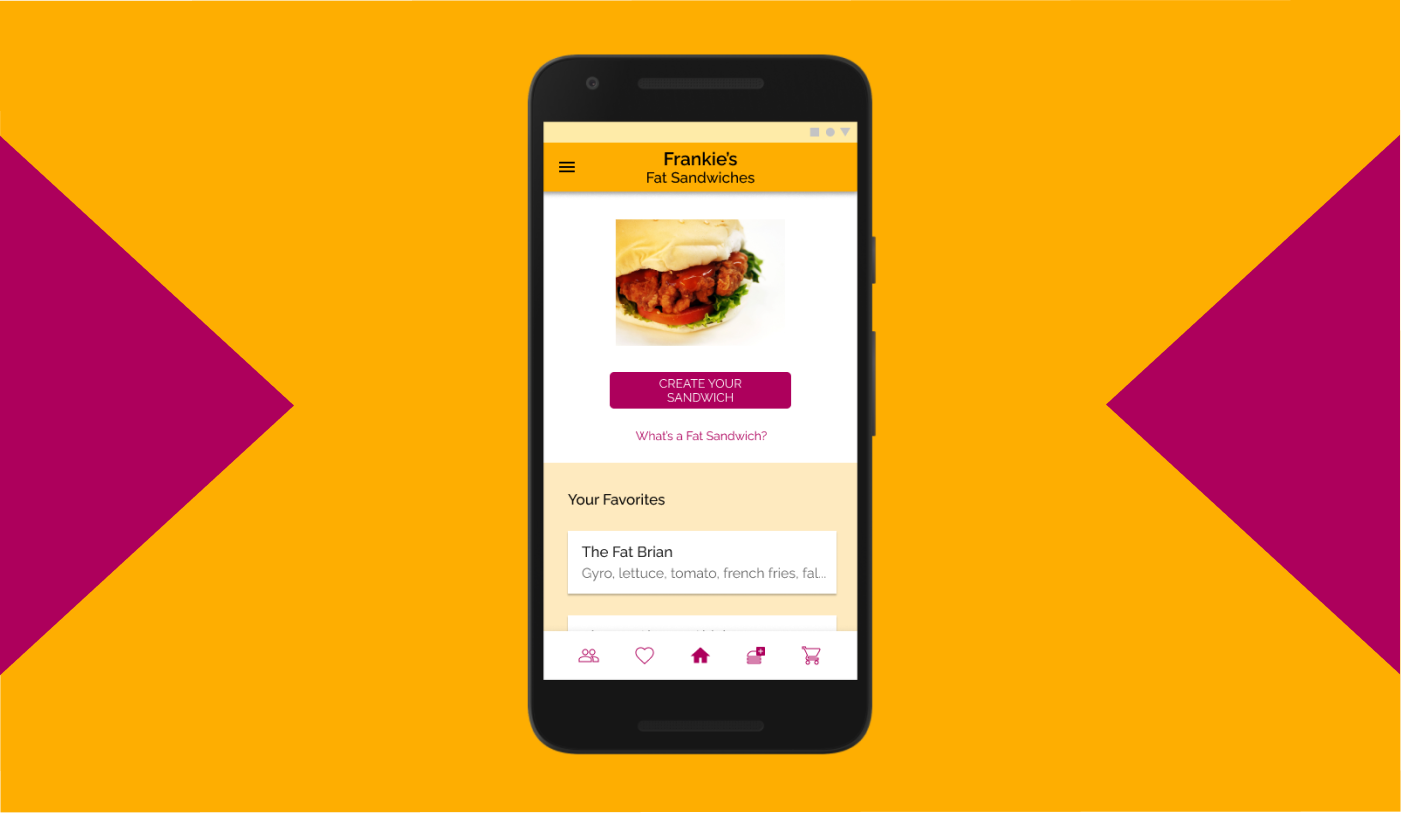
As part of my coursework for the Google UX Design Professional Certificate, I was tasked with designing a mobile food ordering app for restaurant that sells a regional specialty. I created an app for a fictional restaurant named “Frankie’s Fat Sandwiches” which sells “fat sandwiches,” a type of sandwich popular in New Jersey known for their inclusion of eccentric junk food items like mozzarella sticks and French Fries.
Project duration: May - August 2021
Project Overview
The problem:
Delivering a unique experience that would stand out among the many popular mobile food ordering apps, and give users a chance to appreciate the variety of combinations that fat sandwiches can come in.
The goal:
Create a unique spin on the fat sandwich ordering process, allowing customers to fully customize and personalize them.
My roles:
My roles on the project.
Responsibilities:
UX research, wireframing, prototyping, user testing.
UX Research
Research Summary:
Research activities for this project consisted primarily of user interviews. Four interviews were conducted with users who had been sourced online and screened based on whether they typically order food using mobile food ordering apps. I wanted to assess two research hypotheses that would be relevant for ordering custom fat sandwiches via an app:
People like having the option to customize their food.
People also don’t like having to go through too many steps to order their food or for the process to be too complicated.
While I confirmed that my second hypothesis was generally correct, most users gave lukewarm responses when asked about customizing food. They weren’t opposed to it, but weren’t always interested in doing so.
Pain Points:
Information Overload - Mobile food ordering apps often contained cluttered, visually muddled menus and home pages. It will be important to strive for a simple and straightforward presentation for my app.
High Costs - Orders placed on mobile food ordering apps are often more expensive. While I will not address extra fees in my design I will strive to help users carefully control how much they are spending.
Choice Paralysis - Users can get stuck when presented with the myriad options mobile food ordering apps offer. For my design I will strive to keep menus streamlined and allow users to select from preset sandwich options if they wish.
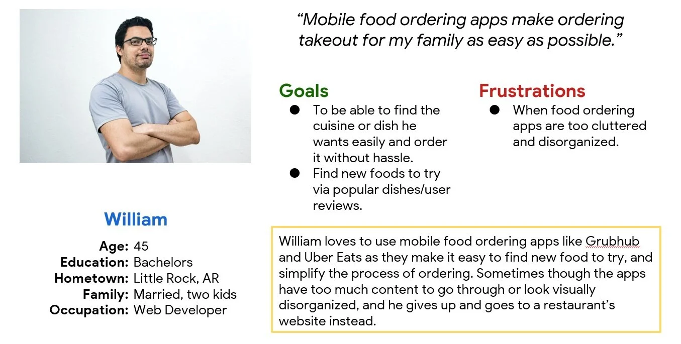
Persona: William
Problem Statement: William is a father and busy professional who needs a fun and easy method of ordering takeout because he has limited time and his family all want different things.
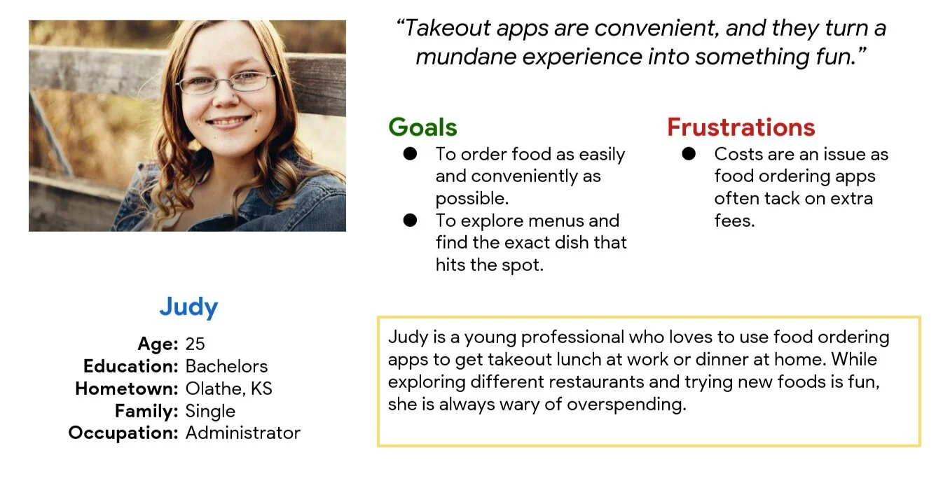
Persona: Judy
Problem Statement: Judy is a young adult who needs a fun takeout experience, but also one that helps her be conscious of her spending, because she does not want to spend too much of her money on food.
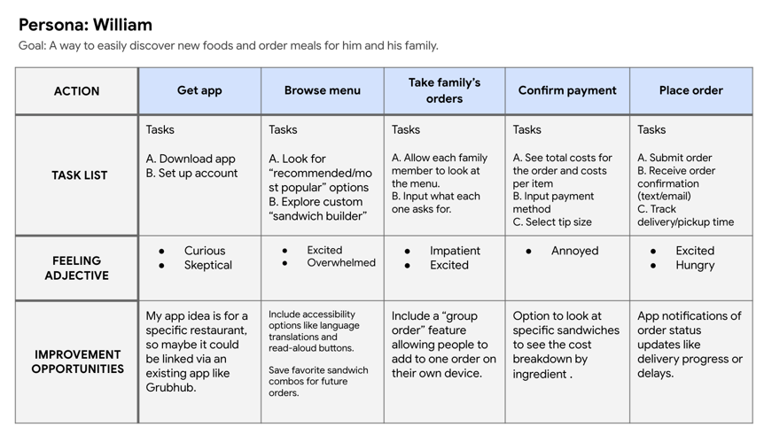
User Journey Map:
Mapping William’s user journey revealed how it important it would be to give users multiple ways to use the app: a unique custom sandwich builder that grants them total freedom, or preset options that save time and make the order easier.
Starting the Design
Paper Wireframes:
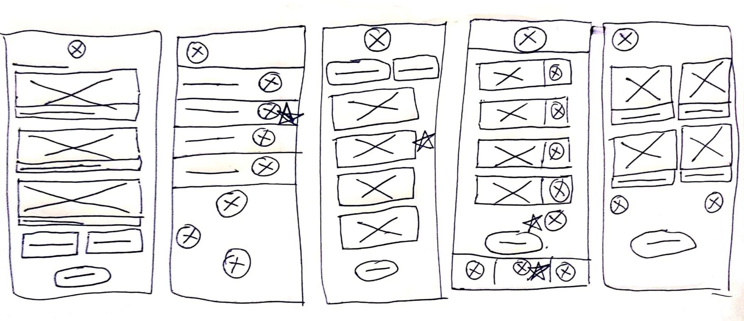
For most of my wireframes, I sketched out five different versions of the most important pages, then combined the best elements each into one more refined wireframe for that page.
Stars indicate aspects I was interested in carrying over into the next version.
The next version, incorporating elements I liked from the previous five sketches.
Digital Wireframes:
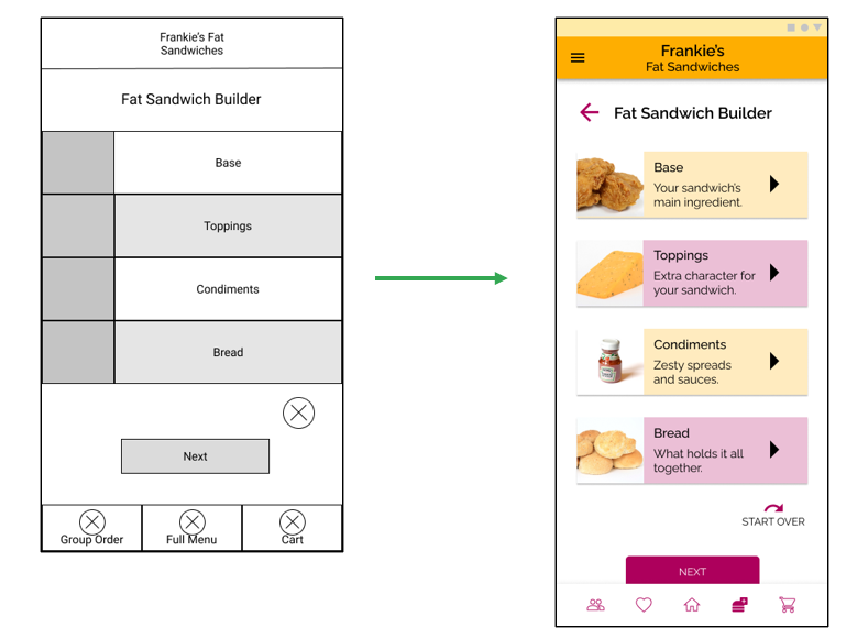
The users I spoke to expressed that they don’t always feel incentivized to user customization options, and don’t always have a lot of time. My goal for this sandwich builder page was to split the customization process into four main elements, a presentation I hoped would be very simplified and fun without wasting users’ times.
Having four main sandwich elements simplifies the process for those who may otherwise have little time or patience for sandwich customization.
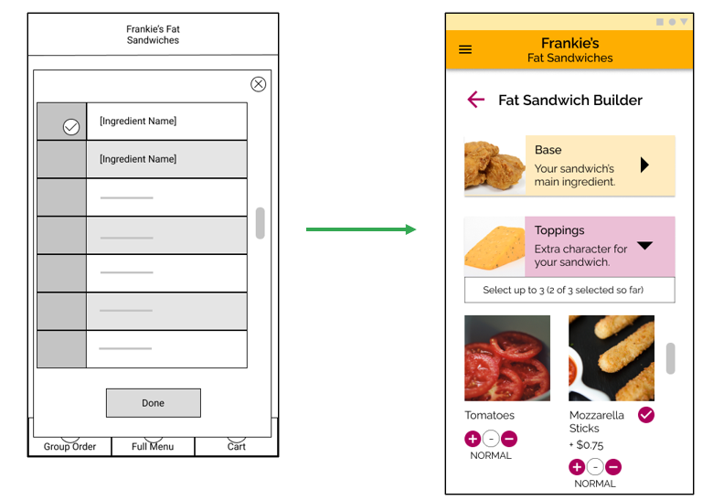
Once one of the four customization categories is selected, a modal opens that permits users to scroll through a list and select the ones they want. I created these ingredient panes to be large enough to include info about costs and nutrition, which I know from my research is important to users.
Ingredient panes include info that is important to users: ingredient name & photo, health info, and costs. And swiping left on the panes reveals buttons which allow users to flip through options of different amounts of an ingredient: regular, double, or half.
Lo-Fi Prototype:
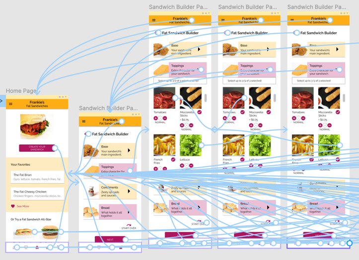
The low-fidelity prototype connects the primary user flow of building and ordering a customized fat sandwich, in preparation for an upcoming usability study.
View the Frankie’s Fat Sandwiches low-fidelity prototype.
1st Usability Study: Parameters
Study type: Moderated Usability Study
Location: Remote
Participants: Five participants between the ages of 18-70 of varying demographic characteristics.
Length: 20-minute tests that took place the week of June 27th – July 2nd 2021.
1st Usability Study: Findings
Much of the constructive feedback centered around ingredient selection.
Key Finding #1: A more obvious cue needs to be added to show users that they can adjust ingredient amounts, as none of the users noticed this functionality on their own.
Key Finding #2: The ingredient selection interaction can be made more appealing by incorporating ingredient selection options in the same single screen instead of presenting them as an overlay.
Key Finding #3: It will improve the experience to include a clear notation of cost along with each ingredient, as users specifically expressed interest in measuring cost per ingredient.
Refining the Design
Mockups:
The ingredient selection screen received the most significant makeover. According with the findings from my test, the ingredient lists can now be found on the same page as the cards for the ingredient categories.
The old sandwich builder page (left), and the new sandwich builder page (right.)
The ingredient lists are expanded under the ingredient category cards when the arrow buttons are tapped. Prices are displayed more clearly and the UI for adjusting ingredient amounts are now always visible, as the old swipe-to-reveal controls were not clear enough during testing.
The old ingredient selection pop-up window on the left, vs. the new ingredient selection dropdown on the right.
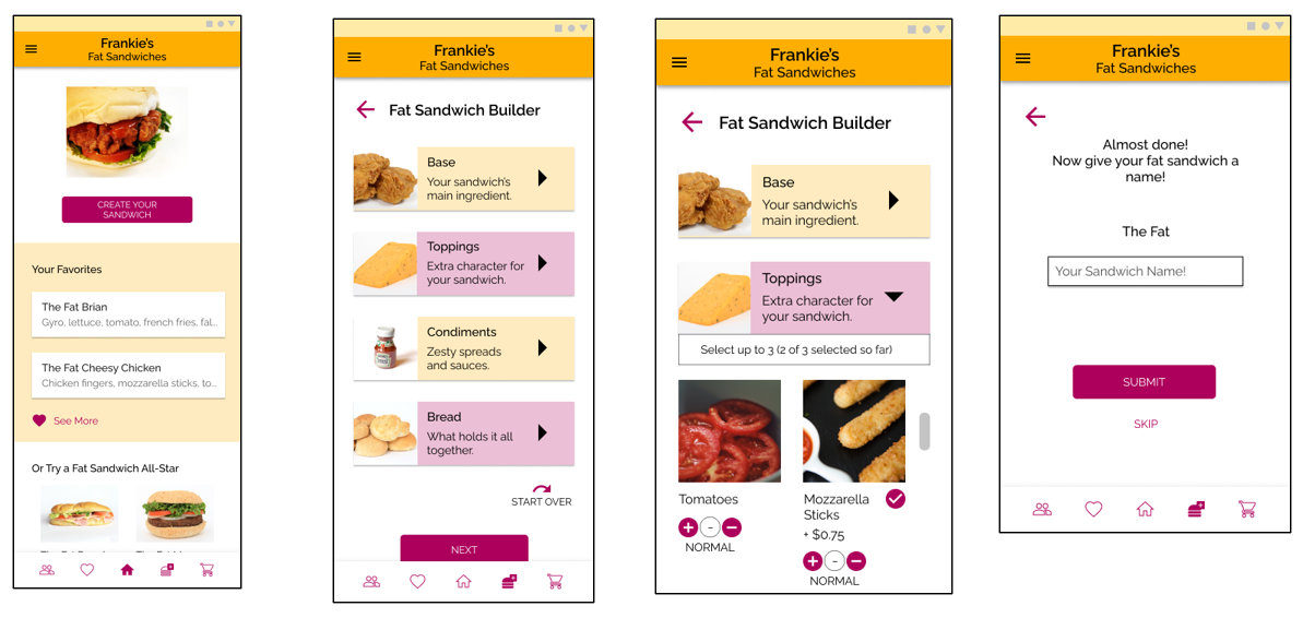
Mockups showing the main screens of the sandwich building process.
High-Fidelity Prototype:
The high-fidelity prototype illustrates the process for creating and ordering the user’s own sandwich. The “Toppings” category was given interactivity as an example of how choosing ingredients from the dropdown would work.
View the Frankie’s Fat Sandwiches high-fidelity prototype.
2nd Usability Study: Parameters
A 2nd usability study was performed in order to verify the design decisions made in the high-fidelity mockups and find other areas that might need improvement.
Study type: Unmoderated study
Location: Remote
Participants: Five participants between the ages of 18-70 of varying demographic characteristics.
Length: 20-minute tests that took place the week of August 23rd – 29th 2021.
2nd Usability Study: Findings
The second round of testing emphasized that users will need to know what a Fat Sandwich actually is in order to properly order one!
Key Finding #1: A button with clearer signifiers/bigger touch target needs to be used for the ingredients dropdown, as the existing UI confused at least one tester.
Key Finding #2: An introduction to what a Fat Sandwich is should be included in the sandwich builder, as users were confused about why mozzarella sticks and French Fries would be considered sandwich toppings.
Key Finding #3: An explanation needs to be added for why Fat Sandwiches are typically given a unique name, and the benefits that doing so in the app can give to users.
Refined Mockups:
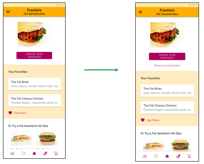
Since users were confused about why the ingredient options were so unusual, and it wasn’t always clear why they had to name their sandwiches, a page was added to explain what Fat Sandwiches are. The link to this optional page appears near the top of the home page for users who need it.
The first version of the Home page mockup (left), vs. the new version with a link to the new page (right.)
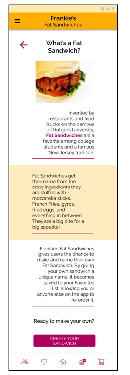
This explainer page gives a brief description of what a Fat Sandwich is, and why it’s considered normal to order things like French Fries on this type of sandwich! It also explains what happens when a user names their sandwich. This explanation is added to the sandwich-naming page as well.
The new Fat Sandwich explainer page.
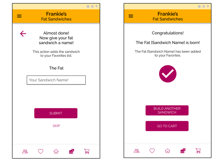
The steps in the sandwich building flow where users name their sandwiches now include a note about the purpose of giving the sandwich a unique name.
Both the screen where users are prompted to name their sandwich (left) and the screen that confirms that the name has been input (right) now contain a new note for users.
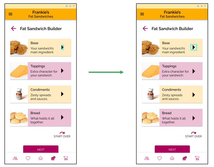
Additionally, upon reviewing the test footage it was clear that the participant understood the arrow button, but was just having a hard time tapping it. To mitigate this the touch target has been increased to 32x32 pixels.
The old sandwich builder page mockup (left), vs. new mockup (right) with bigger touch target (highlighted in blue.)
Revised High-Fidelity Prototype:
Here you can view a revised version of the high-fidelity prototype.
Accessibility considerations:
Consideration #1: All color contrasts meet WCAG AAA standards.
Consideration #2: All affordances that are communicated to the user using color, also use at least one other visual signifier, such as an icon or text.
Consideration #3: Prepared alt text for all images in the prototype for eventual use with screen readers.
Going Forward
Takeaways:
Impact: Usability study participants were enthusiastic about the app, a positive sign that it might resonate with a real audience. “It would be really fun to build a sandwich this way,” said one study participant.
What I learned: Customization can often be a way of engaging users in the ordering process, as long as it is simple and not a chore. Additionally, not everyone will be interested in this specialty cuisine (the “Fat Sandwich”) so it is best to be upfront in the app about what type of food it is.
Future Plans:
Plan #1: Design a way to have users explore the sandwiches made by other users in the app’s community.
Plan #2: Drill down on the way that costs are presented and find a way to tailor the sandwich building feature for cost-conscious users.
Plan #3: Create a more-involved splash page or welcoming demo that introduces users to Fat Sandwiches and their history.
Thank you!
Thank you for reviewing my work on the Frankie’s Fat Sandwiches app! If you would like to contact me about my work, please feel free to reach out to me at mtomasello62@gmail.com.
